Process
7 min read
July 28, 2026
My workflow from brief to delivery
Discover the complete creative process behind North, from interpreting the initial project brief to delivering a refined architecture website that balances timeless aesthetics with functional user experience.

Every successful digital project begins long before the first screen is designed. A thoughtful process creates clarity, aligns expectations, and ensures every design decision supports the goals of both the client and the people who will experience the final product.
North was developed through a structured workflow that prioritized strategy, simplicity, and timeless design from the very first conversation to the final delivery.
1) Understanding the brief
The process started by understanding the studio's vision, target audience, and business goals. Rather than focusing on trends, the objective was to create a digital experience that reflects the architectural philosophy of clarity, proportion, and permanence.
Careful research helped define content priorities, navigation structure, and the visual tone before any layouts were explored.

2) Developing the visual direction
The visual language combines generous whitespace, elegant typography, restrained color palettes, and immersive architectural photography. Every element was chosen to complement the projects rather than compete with them.
Consistency across pages creates a quiet, premium experience that feels timeless regardless of changing design trends.
3) Designing the experience
Layouts were designed to encourage exploration through clear navigation, balanced compositions, and thoughtful spacing. Responsive behavior, subtle interactions, and smooth transitions help users focus on the architecture without unnecessary distractions.
Every component was built to be reusable, making future content updates simple while maintaining visual consistency across the entire website.
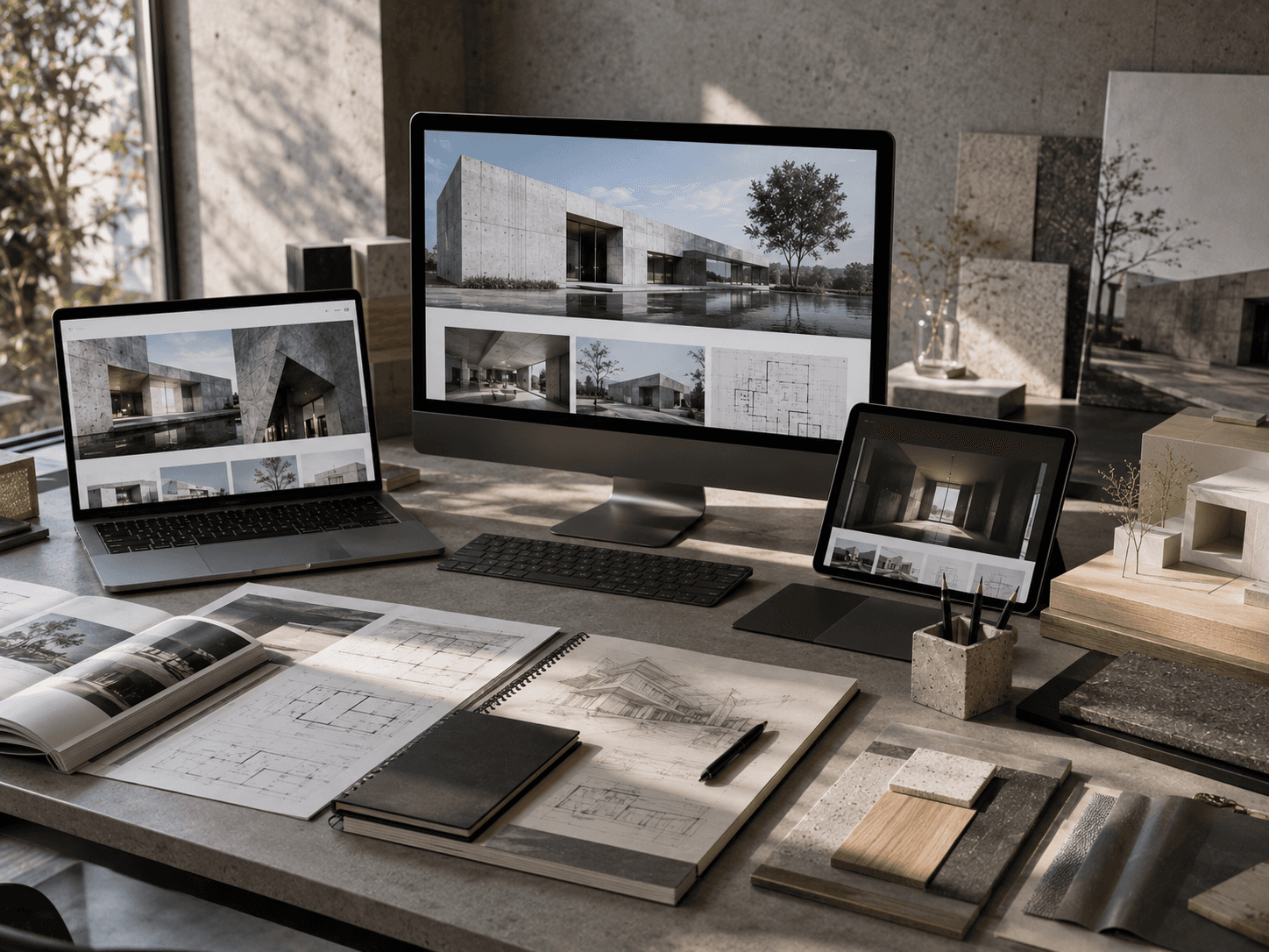
4) Refining and delivering
The final stage focused on polishing typography, optimizing images, testing responsiveness, and refining interactions across different devices. Small improvements throughout the project combined to create a seamless browsing experience.
The result is a flexible architecture website that showcases projects with clarity while remaining easy for clients to maintain and expand over time.
5) Key takeaways
Start every project with strategy before visuals.
Let content guide the layout.
Use restraint to create timeless design.
Build reusable components for scalability.
Refine every detail before delivery.
6) Conclusion
A strong creative process transforms ideas into meaningful experiences. North demonstrates how thoughtful planning, consistent execution, and attention to detail can produce an architecture website that feels refined today while remaining relevant for years to come.


