Process
8 min read
July 24, 2026
Behind the scenes: Making of Pulse
Explore the design process behind Pulse, a modern fitness platform built around intuitive interfaces, meaningful health insights, and a scalable design system for mobile, tablet, and wearable devices.

Designing a fitness application is about more than displaying numbers and charts. The real challenge is transforming complex health data into an experience that feels motivating, understandable, and enjoyable to use every day.
Orbit was created with that goal in mind—a digital fitness companion that combines workouts, activity tracking, recovery, sleep, nutrition, and mindfulness into one cohesive product experience.
1) Understanding the problem
Many fitness applications overwhelm users with information. Multiple dashboards, competing metrics, and inconsistent interfaces often make progress feel confusing instead of motivating.
The design process started by identifying the essential information users need at every moment, removing unnecessary complexity, and creating a clear visual hierarchy that encourages daily engagement.
2) Building the visual language
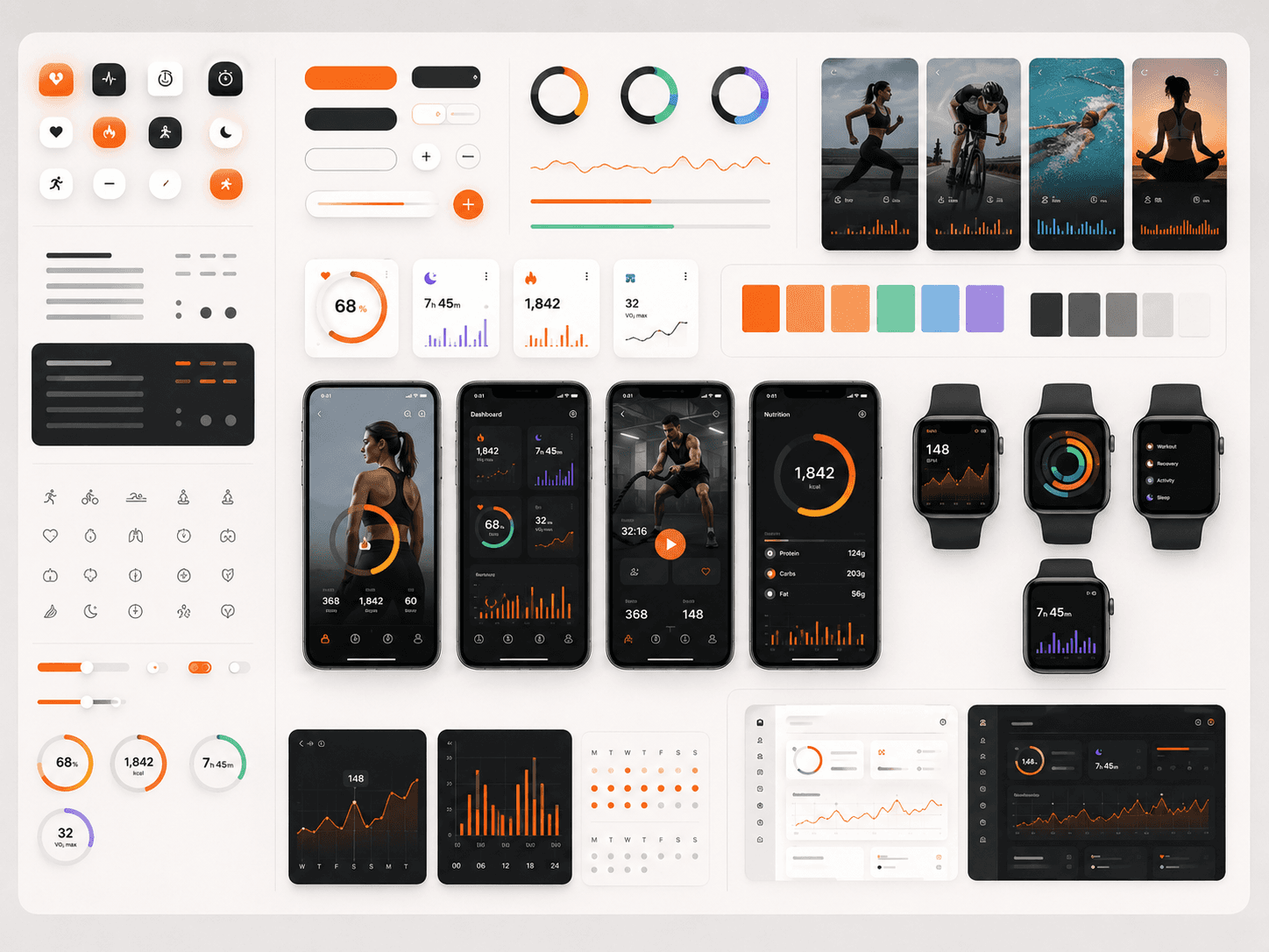
A bold visual identity was developed using dark and light themes, vibrant accent colors, rounded components, and high-contrast typography. Every chart, icon, and interaction was designed to communicate information quickly while maintaining a modern, energetic personality.
Consistency across screens allows users to focus on their fitness goals instead of learning new interface patterns throughout the product.
3) Creating a scalable design system
The interface is powered by a flexible design system containing reusable components, typography scales, spacing rules, color tokens, navigation patterns, and data visualization styles.
This system speeds up product development, improves consistency, and makes it easier to expand new features without redesigning existing experiences.
4) Designing across every device
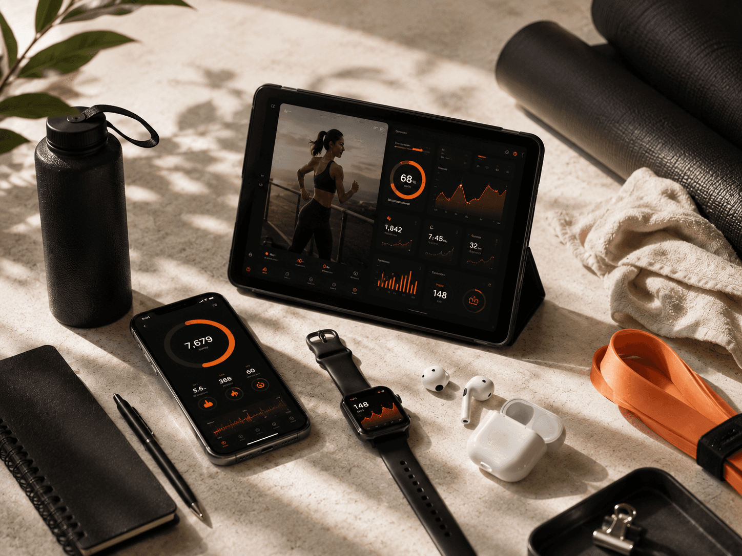
Orbit extends beyond smartphones. The experience adapts seamlessly across tablets and wearable devices, ensuring users receive the right information whether they're exercising, reviewing progress, or tracking recovery throughout the day.
Maintaining visual consistency across different screen sizes creates a connected ecosystem that feels familiar regardless of the device being used.
5) Key takeaways
Prioritize clarity over feature quantity.
Build reusable design systems early.
Design dashboards that guide action instead of displaying everything.
Maintain consistency across every platform.
Use thoughtful visual hierarchy to improve engagement.
6) Conclusion
Behind every polished interface is a structured design process focused on solving real user problems. Orbit demonstrates how thoughtful product strategy, scalable systems, and consistent visual language can transform complex health data into an experience that motivates users to build healthier habits every day.


