Design
6 min read
March 12, 2026
Designing dashboards that feel effortless
Discover how thoughtful hierarchy, spacing, and reusable components transform complex dashboards into intuitive experiences that help users stay focused and productive.

Most dashboards begin with a simple goal—bringing important information into one place. As products evolve, however, new features, widgets, notifications, and data panels are added one after another. Without a clear structure, the interface quickly becomes difficult to scan, forcing users to spend more time searching than working.
A thoughtful dashboard isn't defined by how much information it contains, but by how effortlessly people can understand it. Great interfaces reduce mental effort by presenting information in a clear order, helping users focus on what matters without unnecessary distractions.
1) Design for scanning, not reading
People rarely read dashboards from top to bottom. Instead, they scan the page, searching for visual cues that answer immediate questions. This makes hierarchy one of the most important design principles in dashboard design.
Large headings establish context, grouped content creates relationships, and consistent spacing helps separate one task from another. Primary actions should always be easy to locate, while secondary information remains available without competing for attention.
When every section has a clear purpose, users instinctively know where to look, making the interface feel familiar from the very first interaction.
2) Consistency begins with reusable components
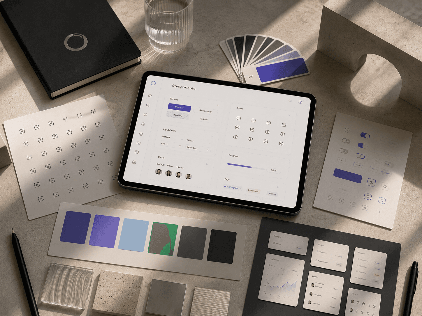
As products grow, maintaining visual consistency becomes increasingly challenging. Rather than designing every screen independently, successful products rely on reusable interface components.
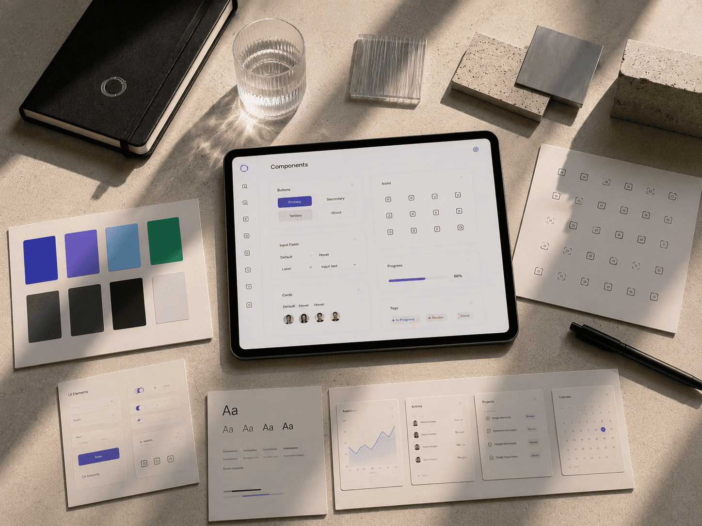
Buttons, cards, status badges, inputs, tables, and navigation patterns should all follow shared rules. A consistent component library not only improves efficiency during development but also builds trust with users by creating predictable interactions throughout the product.
Instead of noticing the interface, users remain focused on completing their work—a sign that the design is doing its job well.
3) Less visual noise creates better decisions
One of the biggest misconceptions in dashboard design is that more information creates more value. In reality, too many competing elements slow decision-making and increase cognitive load.
Thoughtful use of whitespace, restrained color, and clear grouping helps guide attention naturally. Every unnecessary border, shadow, or decoration competes with meaningful information.
Removing visual clutter doesn't make a dashboard feel empty—it gives important content the space it needs to stand out.
4) Key takeaways
Design dashboards for scanning instead of reading.
Use hierarchy to guide attention naturally.
Build reusable components to maintain consistency.
Reduce unnecessary visual noise.
Prioritize clarity over complexity.
5) Conclusion
The most effective dashboards rarely feel complicated, even when they manage complex information. Their strength comes from careful organization, consistent patterns, and deliberate restraint. By focusing on hierarchy, reusable systems, and clarity, designers create interfaces that allow users to think less about the product and more about the work they want to accomplish.

